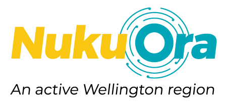
In designing our new visual identity, we wanted it to reflect the growth of the organisation and encapsulate who we are and what we do.
The koru elements in our logo represent the coming together of people and new opportunities, the unfurling of their journeys, and the connections that we form between people and place.
Like a ripple, the benefits of physical activity can expand out across the lives of people and communities to transform their wellbeing. We know that when we have a positive impact on the life of one person, it can have an effect well beyond that individual to generate increasingly positive outcomes for whānau, communities and our region.
Its link to water reflects the connection to the tributaries that flow through the Wellington region, providing connection sustenance, vitality and life.
